The Problem at a Glance
Outdated platform. Missed opportunities
● My Pages was neglected — no recent updates, poor engagement, low business value
● It lacked clarity, hierarchy, and was misaligned with younger audiences
● Navigation was too rigid to support new features or growth
Product Designer, Researcher + UI Lead
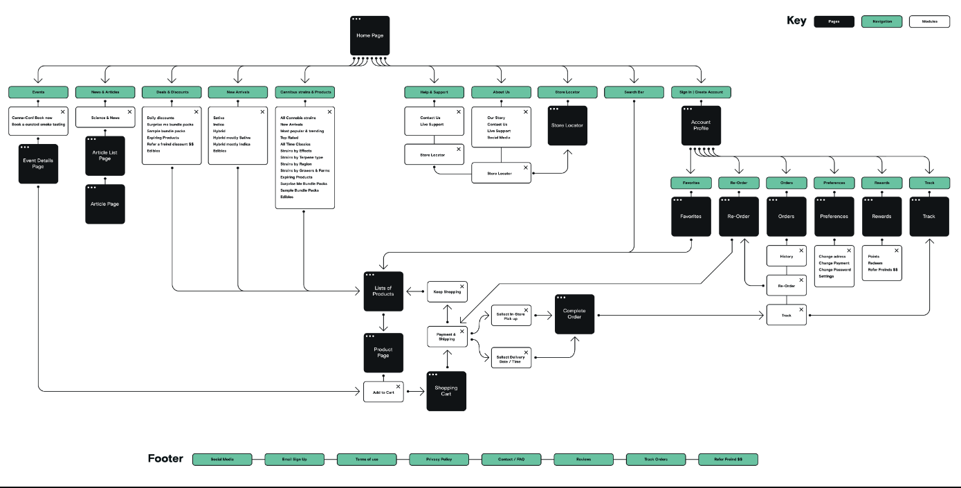
● Led research (interviews + card sorting + benchmarking)
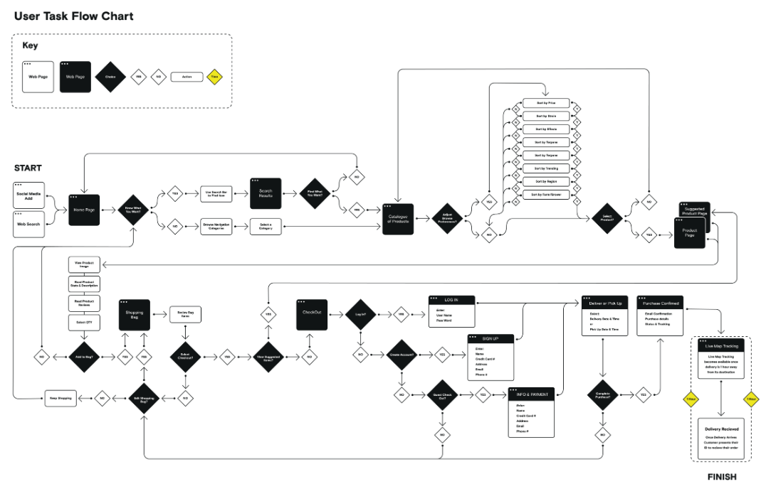
● Created task flows, IA, wireframes, and the new design system features
● Defined personas and clarified user goals (esp. 18–30 y/o)
● Ran usability testing and accessibility checks (AAA compliant in prod)

Using double diamond as framework & tools like Figma UsabilityHub, OptimalWorkshops were used in this project.
What users told us — and how we responded
Understand motivations, behaviors, and reasons for abandonment of the current platform.


● Participants: 10 users interviewed
● Goal: Understand motivations, behaviors, and reasons for abandonment of the current platform.
● Insights gathered:
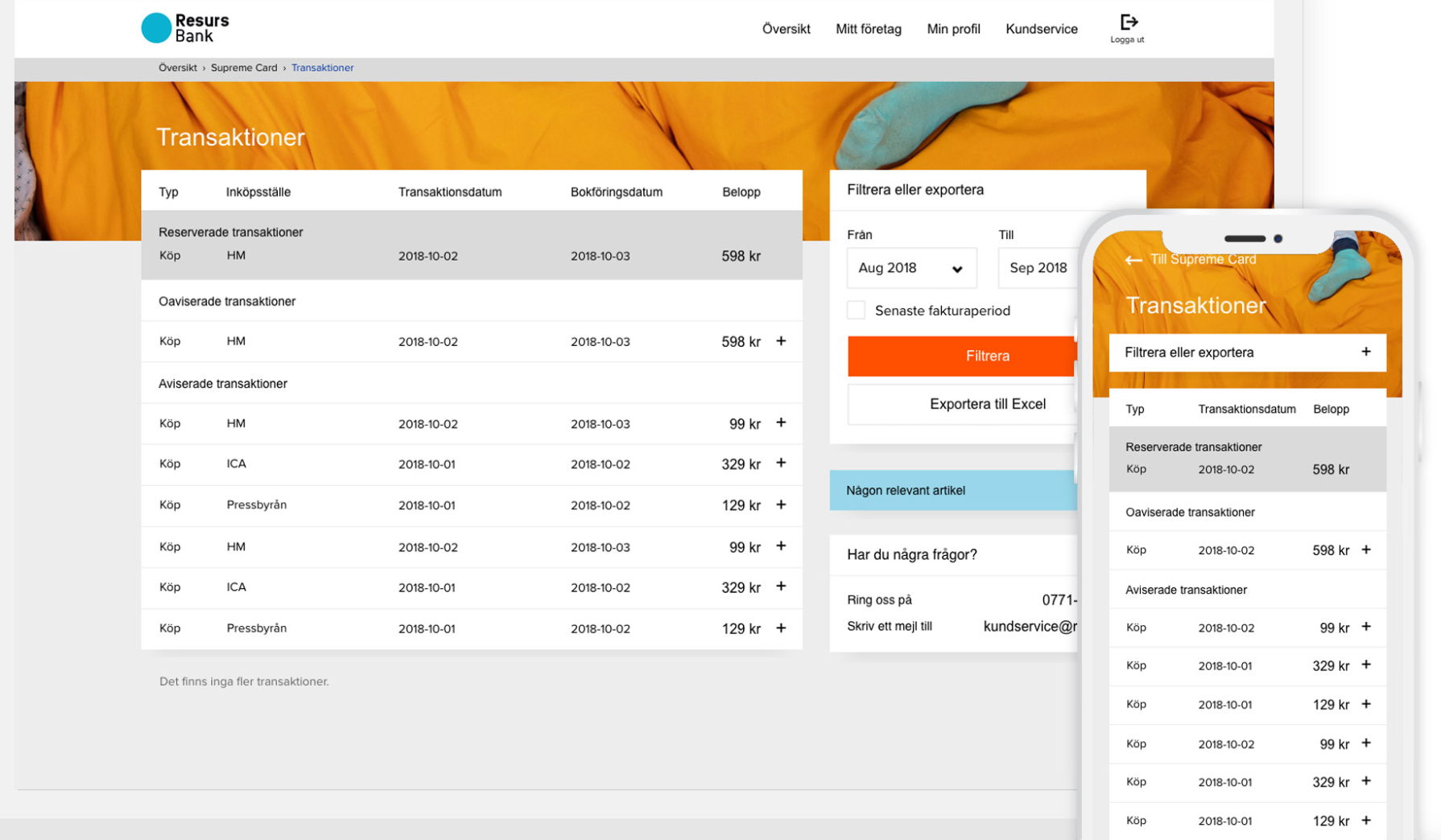
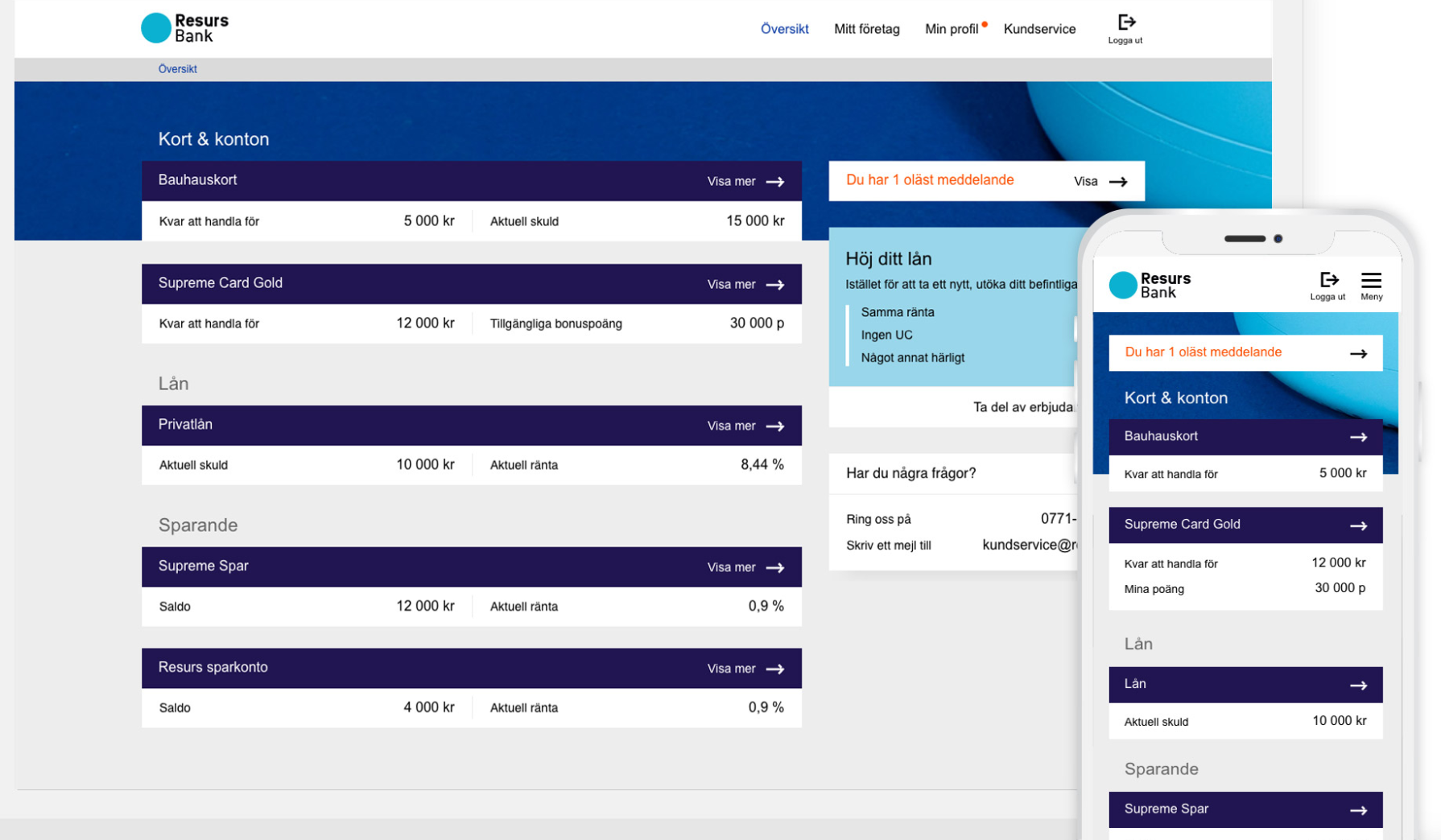
◦ Users couldn’t find recent transactions or loan options easily
◦ Navigation lacked logic and scalability
◦ Preferences for information hierarchy
● Design responses:
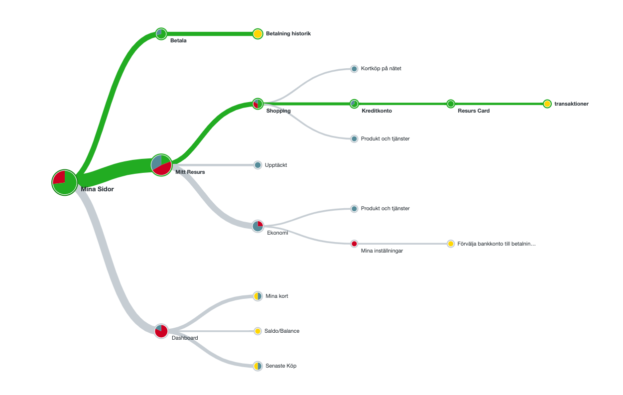
◦ Built task-focused navigation using card sorting & flows ◦ Restructured IA using Popularity Matrix ◦ Applied lifestyle-relevant visual themes (e.g. music, skate, Gen-Z flavor) ◦ Introduced modular dashboard with top 3 quick actions

The making of a customer journey & extracting useful data, (I’m the one without hair ^_^) ).

This analysis compares four prominent
neo-banking players: A, B, Z, and Q. Created a comparison matrix featuring four neobank players (A, B, Z, Q) to understand strengths, weaknesses, and UX trends.
Testing with 10 users aged 18–30 improved success rates
What was tested:
● Task 1: Find recent transaction
● Task 2: Find statement
● Task 3: Search for a 3-month-old payment
What we found:
● Miss-clicks in nav → Fixed layout consistency
● Info density issues → Reduced labels & grouped content
● Results: Task completion improved across all 3 tests

Table showing pre/post success rates per task
The Outcome
A dashboard that connects, converts, and scales
A new modular design that highlights:
● Personalized loan options
● Fast access to key features
● Youth-friendly visual tone (vibrant, clean, Gen-Z inspired)
● Stronger foundation for future features and omnichannel expansion
What I Learned
● Storytelling turns product strategy into alignment fuel
● IA is invisible until it’s broken — then it’s everything
- ● Visual language must grow with the audience
- ● Real impact happens when business, UX, and accessibility meet