The problem
- High cart abandonment. A clunky mobile checkout.

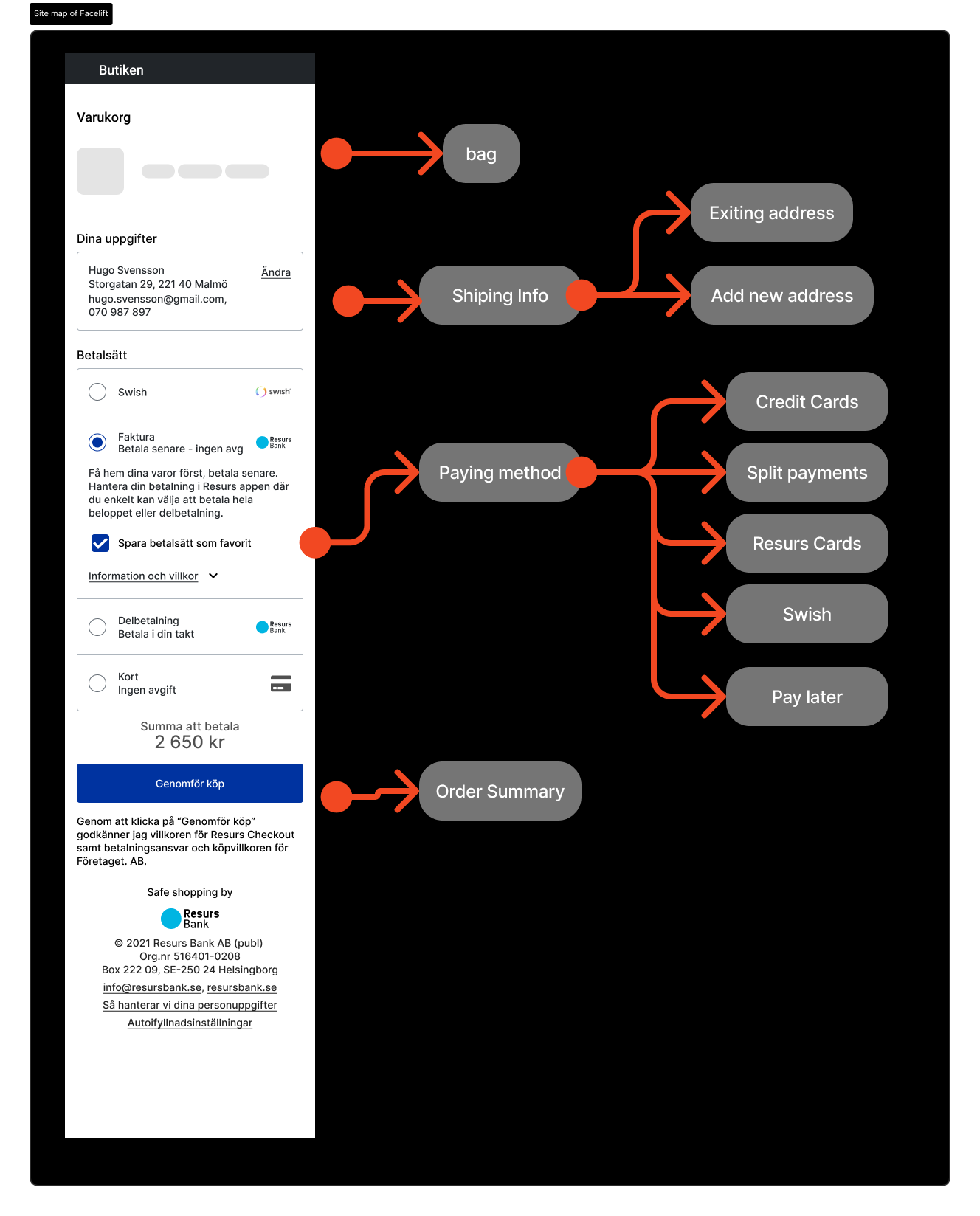
UI was cluttered with repeated fields and exit links
- ● Complex, multi-page flow was turning users away
● UI was cluttered with repeated fields and exit links
● No clear structure guiding the checkout journey
You can use this layout block to write as much or little as you'd like.
You may also paste in embed codes from popular services like Vimeo, SketchFab, and YouTube.
My Role & What I Did
- Product Designer & UX Researcher
- ● Audited checkout journey to pinpoint friction
● Benchmarked competitors (Shopify, Klarna, etc.)
● Proposed shift to single-page checkout
● Created low- and high-fidelity prototypes in Figma
● Built first version of internal UI kit to streamline design
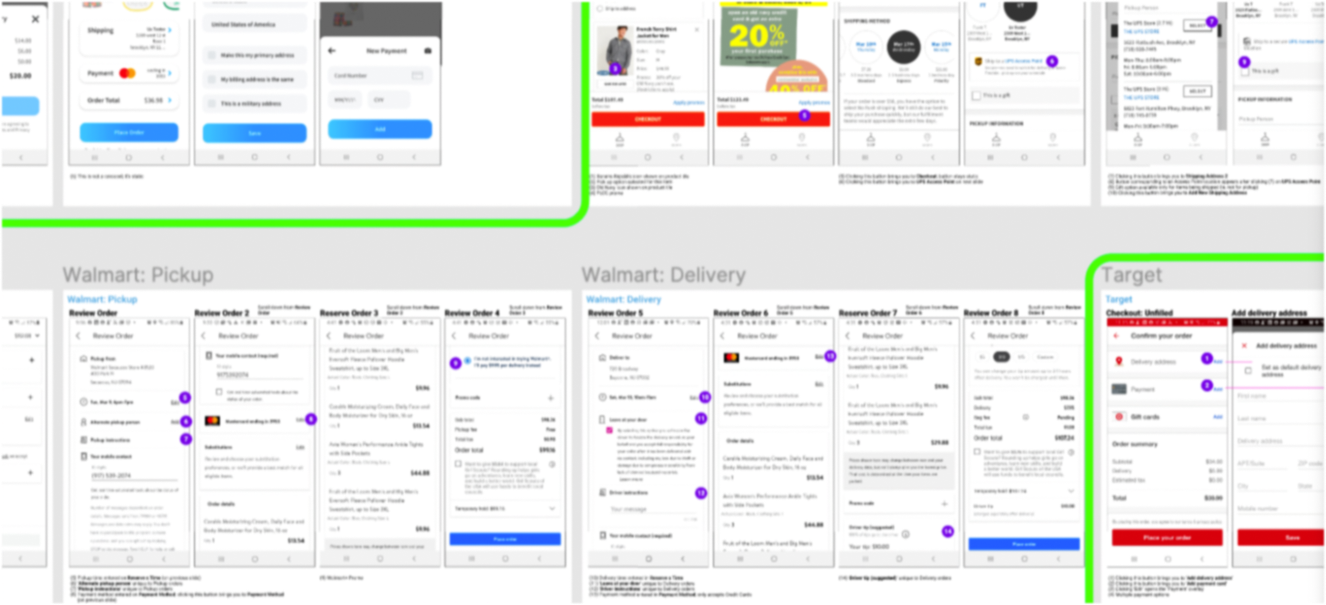
I looked at the most interesting checkouts out there with high volume of transactions
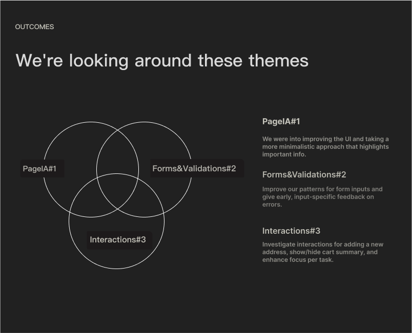
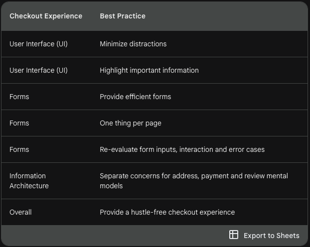
Key Insights & Design Decisions
- Structure matters more than styling.
- ● Removed unnecessary CTAs, links, and inputs
● Consolidated form fields (e.g. merged First/Last name)
● Simplified Page IA using “one action per screen” model
● Designed for mobile-first behavior and focus

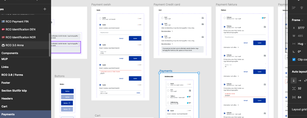
The old Resurs CheckOut, (RCO)
Testing & Validation
Let users choose the winning flow.
● Conducted A/B tests via UsabilityHub and Optimizely
● Focused testing on high-friction areas (e.g. payment module)
● Iterated on interaction patterns based on clickmaps
● Used data to eliminate internal opinion deadlock

A/B testing workflow

This how I set up my A/B testing
The Outcome

Design for action, not admiration — users want speed, not beauty
● Fewer clicks. More conversions. Checkout abandonment dropped from 65% → 48%
- ● Mobile checkout time reduced by 38%
● Field errors dropped by 57%, improving user trust
● Foundation now enables faster A/B testing and modular updates
Key Learnings
- ● Clarity beats complexity — removing UI noise had more impact than any new feature
- ● Testing is learning — even failed tests gave us direction
● Design for action, not admiration — users want speed, not beauty
Demo Prototype

Click and test the checkout!